Is Covid Crisis Lead to Prosperity - Causal Inference from a Counterfactual World Using Facebook Prophet
Posted June 12, 2021 by Gowri Shankar ‐ 12 min read
Identifying one causal reason is more powerful than identifying dozens of correlational patterns from the data, causal inferencing is a branch of statistics concern to effects that are consequence of actions. In traditional machine learning, we infer from the observations of the past asking how something had happened by characterizing the association between variables. On contrary, causal inferencing addresses why an event had happened through randomized experiments.
Why causality is critical, it has been widely believed causal reasoning is the promising path towards generalization. This is the second post on causality where we earlier attempted to bridge causal reasoning with model explainability under the theme correlation does not imply causation. Please refer
In this post, we are introducing the mathematical intuition behind causality, fairness, explanation and subsequently create a counterfactual world using Facebook Prophet forecasting tool in a retrospective mood. I hope this post will render all necessary instincts to dive deeper in the forthcoming posts on superior causal modeling schemes like DoWhy, Causal Recovery Tool box, Causal DNN etc.

- Image Credit: A bear market and a bull market
It’s a big thing to integrate [causality] into AI. Current approaches to machine learning assume that the
trained AI system will be applied on the same kind of data as the training data. In real life it is often
not the case.
- Yoshua Bengio
Lots of people in ML/DL [deep learning] know that causal inference is an important way to
improve generalization.
- Yann LeCun
Objectives
The objective of this post is to formalize the intuition behind causal inferencing and counterfactuals worlds. We also learn about
- Causal Graphs
- Causal Explanation and Fairness
- Facebook Prophet Forecasting Library
Introduction
What makes us human is our ability to rationalize events in terms of cause and effect. i.e The inherent capability to assess why something had happened or have to happen to make a corrective actions and hoping to improve the future outcomes. However, in traditional ML/Deep Learning - learning happens out of correlated features, where features that are available does not completely represent the world. Bridging the gap between known world and unknown world through causal reasoning will realize generalization, a stepping stone for artificail general intelligence.
Performance of traditional machine learning models degrade due to concept and data drift over time, I mean a well tested and deployed model in the field tend to go obsolete. Continuous development and integration schemes address the data drift problem but the robustness of the model degrades eventually. On contrary, causal inferencing focus on what might have happened when there is lack of information through randomized control trials(RCTs) or A/B tests. It also addresses the classic problem of Out of Distribution to certain extent.
Counterfactual World Conundrum
Purely observational data does not account the attributes of the counterfactual world. i.e certain actions are taken and the effect of those actions are recorded in the dataset, in case those actions are not taken in an alternate universe - What could have been the effect? Let us ilustrate this
$X$ causes $Y$ iff $X$ leads to a change in $Y$, i.e. $(X \rightarrow Y)$ - keeping everything else constant $$then$$ $$\Large \text{Causal Effect} = \overbrace{ E[ Y|do(X=1)]}^{\text{ Real World }} - \underbrace{ E[Y|do(X=0)] }_{\text{Counterfactual World}} \tag{1. Causal Effect}$$ Causal effect is the magnitude by which $Y$ is changed by a unit change in $X$.

This illustration renders the change in NFTY 50 Index when the covid crisis started during Feb, 2020 and lockdown effect by Mar/Apr, 2020 - We are studying this dataset in the subsequent section in depth.
For example, In a farm field everything is automated using an expert system that is powered by sensors and actuators.
- Moisture level of the soil is fed to the expert system through sensors
- If the soil moisture level goes below certain threshold, actuators triggers to kick start the water supply
- Atmospheric temperature is monitored and recorded
- Subsequently, moisture level of the soil also recorded
Sensors ensured the farm field is watered as and when the temperature goes up which inherently lead to maintaining the moisture of the soil in acceptable level. The data of temperature and soil moisture levels are collected and they are quite correlated.
This observational data is fed into an AI system which is about to augment the expert system based on historical observations. However the AI system ended up recommending No Watering when there is High Temperature because the expert system ensured watering whenever temperature peaks, resulting in high temperature leads to high moisture level.
In causal inferencing, empahsis is given for the counterfactual world where an intervention did not happen ie $E[Y|do(X=0)]$ and it’s effects are measured.
Prediction Accuracy and Modeling through Causal Graphs
From data, we can build models and train them for a better prediction metrics(e.g. Loss, Accuracy etc) but data alone is not sufficient for causal inferencing. It has to be augmented with domain knowledge and assumptions. Further, we cannot calculate the causal effect because we cannot observe the counterfactual world - we can only estimate.
Meanwhile, without a loss function we cannot build a predictive model. For a traditional machine learning model the loss function is
$$min \sum_{(x, y)} loss(h(x), y) \tag{2. Correlational ML}$$ then through Causal Learning
- Identify which features directly cause the outcome
- Build a predictive model using only those features
$$min \sum_{(x_c, y)} loss(h(x_c), y) \tag{3. Causal ML}$$
Where,
- $x_c$ is subset of the features $x$
- $h(.)$ is the predicted value
There are fundamental challenges to address to infer causal effect, let us start with the following 4 steps suggested by Emre Kiciman and Amit Sharma of Microsoft Research.
- Modeling: Create a causal graph to encode assumptions
- Identification: Formulate what to estimate
- Estimation: Compute the estimation
- Refutation: Validate the assumptions
Modeling through Causal Graphs
Converting domain knowledge into a formal causal assumptions and relationships between outcome and variables is the key aspect of causal modeling.
For example, the below relationship says the following
- $A \rightarrow C$, $B \rightarrow C$, $C \rightarrow D$, $D \rightarrow E$, $D \rightarrow F$
- $A \nleftrightarrow B$, $D \nleftrightarrow A | C$, $E \nleftrightarrow C | D$, $\cdots$

It is quite impossible to infer this graph from a dataset alone and assumptions are encoded by missing edges and direction of the edges.
We spoke about Out of Distribution (OOD) using inductive biases several times in the quest of achieving artificial general intelligence. Wrt causal models, it has been observed, OOD errors are lower than correlated models. This is due to $P(Y|X_c)$ is invariant across different distributions, unless there is a change in true data-generating process for $Y$.
Explanation and Fairness
Causal reasoning provides meaninful definitions of machine learning explanation and fairness to achieve a responsible and trustworthy models.
Counterfactual explanation: Given a current prediction of a ML model, what features should be changed to flip the model’s outcome.
For e.g. Model predicts admission: REJECT for a student who applied for Ivy league schools based on the SAT scores. A counterfactual explantion would give, what SAT score is expected to change the outcome to admission: ACCEPT.
Counterfactual fairness: If the model provides counterfactual explanations only using sensitive attributes like ethnicity, gender, color etc of a person - We can infer model is biased.
An ML model is fair if the probability of its output remains invariant to any changes in the sensitive
attribute, ekkping all non-descendents of the sensitive attribute fixed.
- Kusner et al. 2017
For e.g. Model predicts admission: REJECT for a student and admission: ACCEPT for the student when the color attribute is changed, then the model is biased.
Forecasting the Counterfactual World
Disclaimer: This experiment is not possible in the real world. Our intention is to understand $eq.1$ by creating a counterfactual world where there is no Covid using Facebook Prophet forecaster.
In this section, we shall take financial index of NIFTY 50 from Yahoo Finance and understand causality in the context of Covid Lockdowns. By doing a simple exploratory anaylysis, we identify the sudden change in the index and assuming it is due to covid. i.e. around mid of Feb, 2020 - It has been noticed the pandemic awareness was spreading among the people and markets across the world started reacting. This reaction lead to downward trend in the NIFTY 50 Index.
Real World: We have the real world data
Counterfactual World: We shall forecast the counterfactual world NIFTY Index using Facebook Prophet.

import pandas as pd
import numpy as np
import matplotlib.pyplot as plt
import random
import seaborn as sns
from fbprophet import Prophet
from datetime import datetime

pd.options.mode.chained_assignment = None  # default='warn'
nfty_50_df = pd.read_csv("./nse_50_yf.csv", parse_dates=['Date'])
nfty_50_df.head()
| Date | Open | High | Low | Close | Adj Close | Volume | |
|---|---|---|---|---|---|---|---|
| 0 | 2016-03-04 | 7505.399902 | 7505.899902 | 7444.100098 | 7485.350098 | 7485.350098 | 281700.0 |
| 1 | 2016-03-08 | 7486.399902 | 7527.149902 | 7442.149902 | 7485.299805 | 7485.299805 | 257000.0 |
| 2 | 2016-03-09 | 7436.100098 | 7539.000000 | 7424.299805 | 7531.799805 | 7531.799805 | 245100.0 |
| 3 | 2016-03-10 | 7545.350098 | 7547.100098 | 7447.399902 | 7486.149902 | 7486.149902 | 224700.0 |
| 4 | 2016-03-11 | 7484.850098 | 7543.950195 | 7460.600098 | 7510.200195 | 7510.200195 | 198700.0 |
nfty_50_df = nfty_50_df.sort_values("Date")
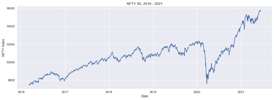
plt.figure(figsize=(15, 5))
plt.style.use('seaborn')
plt.plot(nfty_50_df.Date, nfty_50_df.Close)
plt.xlabel("Date")
plt.ylabel("NFTY Index")
plt.title("NFTY 50, 2016 - 2021")
Text(0.5, 1.0, 'NFTY 50, 2016 - 2021')
Data Preprocessing and Exploration
From the data, we identified the market started reacting to the covid crisis sharply 16th Feb 2020 onwards. Covid news is a confounding variable that the market was not aware during that time. What we are doing is travel backward in the time dimension by splitting the data into no-crisis and crisis days and label them.
CRISIS_CUTOFF = datetime.strptime('2020-02-16', '%Y-%m-%d')
DAY_OF_DELUGE = datetime.strptime('2020-03-25', '%Y-%m-%d')
crisis_df = nfty_50_df[nfty_50_df.Date >= CRISIS_CUTOFF]
crisis_df.loc[:, "CovidCrisis"] = True
no_crisis_df = nfty_50_df[nfty_50_df.Date < CRISIS_CUTOFF]
no_crisis_df.loc[:, "CovidCrisis"] = False
nfty_50_df = pd.concat([no_crisis_df, crisis_df])
no_crisis_df.head()
| Date | Open | High | Low | Close | Adj Close | Volume | CovidCrisis | |
|---|---|---|---|---|---|---|---|---|
| 0 | 2016-03-04 | 7505.399902 | 7505.899902 | 7444.100098 | 7485.350098 | 7485.350098 | 281700.0 | False |
| 1 | 2016-03-08 | 7486.399902 | 7527.149902 | 7442.149902 | 7485.299805 | 7485.299805 | 257000.0 | False |
| 2 | 2016-03-09 | 7436.100098 | 7539.000000 | 7424.299805 | 7531.799805 | 7531.799805 | 245100.0 | False |
| 3 | 2016-03-10 | 7545.350098 | 7547.100098 | 7447.399902 | 7486.149902 | 7486.149902 | 224700.0 | False |
| 4 | 2016-03-11 | 7484.850098 | 7543.950195 | 7460.600098 | 7510.200195 | 7510.200195 | 198700.0 | False |
Facebook Prophet Forecasting
Let us use the sophisticated forecasting tool Prophet from Facebook to predict the market dynamics of the counterfactual world using the data from No Covid Crisis period. We are feeding 4 years of historical data(i.e. from 2016 - 2020) to predict the period of Covid Crisis(i.e. March 2020 - June 2020)
forecast_df = no_crisis_df[["Date", "Close"]]
forecast_df = forecast_df.rename(columns = {
    'Date': 'ds', "Close": 'y'
})

m = Prophet()
m.fit(forecast_df)
plt.figure(figsize=(20, 5))
future = m.make_future_dataframe(periods=len(crisis_df))
forecast = m.predict(future)
INFO:fbprophet:Disabling daily seasonality. Run prophet with daily_seasonality=True to override this.


<Figure size 1440x360 with 0 Axes>
figure = m.plot(forecast, xlabel='Date', ylabel='Close', figsize=(15, 5))
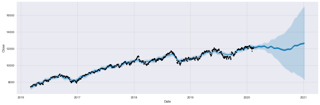
Compare the forecast with actuals. Counterfactual world is quite stable and predictable with low or insignificant volatility.
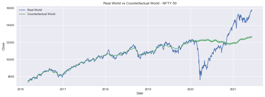
nfty_50_df["Forecast"] = forecast["yhat"]
plt.figure(figsize=(15, 5))
sns.lineplot(data=nfty_50_df, x="Date", y="Close", label="Real World")
sns.lineplot(data=nfty_50_df, x="Date", y="Forecast", label="Counterfactual World")
plt.title("Real World vs Counterfactual World - NFTY 50")
Text(0.5, 1.0, 'Real World vs Counterfactual World - NFTY 50')
Is Covid Crisis Lead to Wealth Creation?
To answer our question, we shall turn to our causal effect equation $\overbrace{ E[ Y|do(X=1)]}^{\text{ Covid Crisis }} - \underbrace{ E[Y|do(X=0)] }_{\text{No Covid}}$ by accomplishing following steps
- Removing the null values due to holidays or data not recorded days
- Normalize the forecasted and the actual NFTY 50 index
- Calculate the causal effect using $eqn.1$
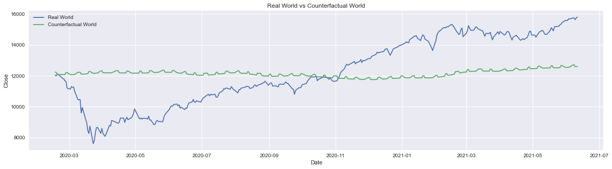
crisis_df = nfty_50_df[nfty_50_df["Date"] >= CRISIS_CUTOFF]
plt.figure(figsize=(20, 5))
sns.lineplot(data=crisis_df, x="Date", y="Close", label="Real World")
sns.lineplot(data=crisis_df, x="Date", y="Forecast", label="Counterfactual World")

plt.title("Real World vs Counterfactual World - NFTY 50")
Text(0.5, 1.0, 'Real World vs Counterfactual World')
crisis_df.isnull().sum()
crisis_df.dropna(inplace=True)
crisis_df.isnull().sum()
Date           0
Open           0
High           0
Low            0
Close          0
Adj Close      0
Volume         0
CovidCrisis    0
Forecast       0
dtype: int64
y_hat = crisis_df["Forecast"].values
normalized_y_hat = (y_hat - np.mean(y_hat)) / np.std(y_hat)

y = crisis_df["Close"].values
normalized_y = (y - np.mean(y)) / np.std(y)
causal_effect = np.sum(normalized_y - normalized_y_hat)
causal_effect, np.allclose(causal_effect, 0)
(-1.0516032489249483e-12, True)
Our calculated causal effect is -0.00000000000010516… infers there is no evidence of wealth creation during the crisis period and also there are no significant sign of losses. This process can be reused as a retrospective scheme to find out the short/mid-term gains/losses.
Annexe: Exploratory Data Analysis
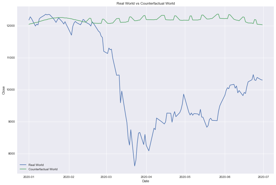
The Great Fall
Due to pandemic awareness and lockdown from mid of Feb, 2020.
deluge_df = nfty_50_df[(nfty_50_df["Date"] >= datetime.strptime('2020-01-01', '%Y-%m-%d')) & (nfty_50_df["Date"] < datetime.strptime('2020-07-01', '%Y-%m-%d'))]
plt.figure(figsize=(15, 10))
sns.lineplot(data=deluge_df, x="Date", y="Close", label="Real World")
sns.lineplot(data=deluge_df, x="Date", y="Forecast", label="Counterfactual World")

plt.title("Real World vs Counterfactual World")
Text(0.5, 1.0, 'Real World vs Counterfactual World')
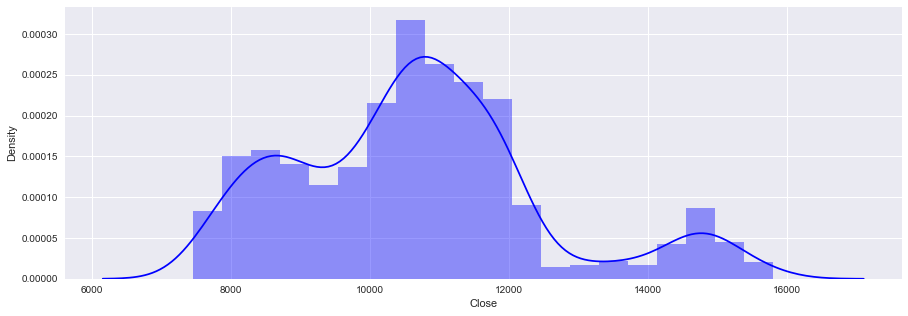
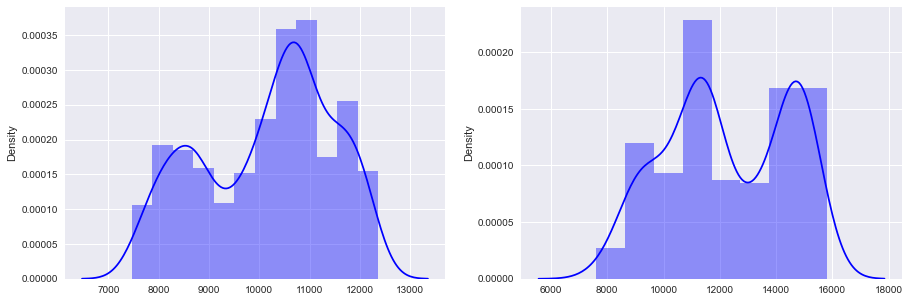
Right Tail in Distribution
Density plot gives us an idea about the market dynamics, the observations are
- Until the crisis began, Index seldom crossed
13000mark - There are really bad days like
24th/25th March 2020where it dropped down to~8000mark - However, as the awareness of the pandemic spreads, market surge is observed
- A right long tail of notable dense trading appeared concetrating at
15000mark - On the covid crisis period, a bimodal density distribution is observed with almost similar peaks.
# Plot distribution of the average price
plt.figure(figsize=(15, 5))
sns.distplot(nfty_50_df.Close, color='b')
/Users/shankar/dev/tools/anaconda3/envs/prophet/lib/python3.8/site-packages/seaborn/distributions.py:2557: FutureWarning: `distplot` is a deprecated function and will be removed in a future version. Please adapt your code to use either `displot` (a figure-level function with similar flexibility) or `histplot` (an axes-level function for histograms).
  warnings.warn(msg, FutureWarning)


<matplotlib.axes._subplots.AxesSubplot at 0x7fbc1b1d78b0>
fig, (ax1, ax2) = plt.subplots(1, 2, figsize=(15, 5))
sns.distplot(ax = ax1, x=no_crisis_df.Close, color='b')
sns.distplot(ax = ax2, x=crisis_df.Close, color='b')
/Users/shankar/dev/tools/anaconda3/envs/prophet/lib/python3.8/site-packages/seaborn/distributions.py:2557: FutureWarning: `distplot` is a deprecated function and will be removed in a future version. Please adapt your code to use either `displot` (a figure-level function with similar flexibility) or `histplot` (an axes-level function for histograms).
  warnings.warn(msg, FutureWarning)


<matplotlib.axes._subplots.AxesSubplot at 0x7fbc1b126d60>
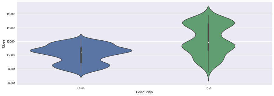
High Volatility
Violin plot shows the fluctuation in average index, where crisis periods are quite volatile but the area remains almost same - Again, correlation does not imply causation. i.e. Covid crisis may not have an impact on overall wealth creation. Is it clever to say, anything that goes up has to come down and vice versa… covid has no impact and life moves on. However, historical studies points every crisis is followed by a period of prosperity.
plt.figure(figsize=(15, 5))
sns.violinplot(y='Close', x='CovidCrisis', data=nfty_50_df)
<matplotlib.axes._subplots.AxesSubplot at 0x7fbc1b33a9d0>
Inference
Causal inferencing is challenging process, It is one of the key research areas in machine learning where there are schemes suggesting causality based deep neural network architectures. In this post, we explored causality at a very high level and simulated a counterfactual world using Facebook Prophet. We also found evidences of no prosperity during the crisis period. In the future posts, we shall explore sophisticated causal modelling framworks like DiCE, CDT etc..
Reference
- Inferring the effect of an event using CausalImpact by Kay Brodersen, 2016
- From how to why: An overview of causal inference in machine learning by Ravi Pandya, 2020
- Causal Models Stanford Encyclopedia of Philosophy
- Causal inference using deep neural networks Yuan et al CMU, 2020
- Foundations of causal inference and its impacts on machine learning webinar by Amit Sharma and Emre Kiciman of Microsoft Research
- Causal Discovery Toolbox: Uncover causal relationships in Python Diviyan et al INRIA, 2019
- 7 – Causal Inference Lucas et al, 2020
- Implementing Causal Impact on Top of TensorFlow Probability by will Fuks, 2020
- Structural Time-Series Forecasting with TensorFlow Probability: Iron Ore Mine Production by Chris Price, 2020
- Facebook Prophet - Forecasting at Scale
- DiCE -ML models with counterfactual explanations for the sunk Titanic by Yuya Sugano, 2020
- DiCE: Diverse Counterfactual Explanations for Hotel Cancellations by Michael Grogan, 2020